Form controls
AyaNova forms have a common set of controls that are used to enter and display information.
Address
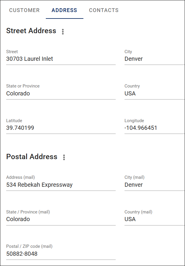
The address control is used to enter both a postal address and physical address.
AyaNova supports longitude and latitude entry for the physical or "street" address to support servicing mobile or remote locations without street addresses. If using a location aware device such as a smart phone you can automatically set the street address longitude and latitude see context menu options below
Items with an address can make use of the View on map menu option.
Street address context menu
The street address context menu is accessed by clicking on the 3 vertical dot context menu icon beside the title "Street address" and has the following options:
Copy to clipboardcopies the street address to the device clipboard.Copy to Postal addresscopies the street address fields into the same Postal address fields to save typing if identicalSet co-ordinates to current locationwill attempt to set the longitude and latitude automatically. Note that this depends upon the capabilities of the device in use and whether the browser has permission to access the device's location. This feature will have a short delay while your device determines the location and sets it in the form.
Postal address context menu
Copy to clipboardcopies the street address to the device clipboard.Copy to Street addresscopies the street address fields into the same street address fields to save typing if identical
Attachment
The attachment control is used throughout AyaNova on every business object form to attach files to objects and is documented in it's own Attachments documentation page
Autocomplete
The Autocomplete list is at the heart of many forms in AyaNova and is provided to quickly search for and select a related AyaNova business object. For example a Customer on a Work order.
There are many features in an Autocomplete list and it has it's own Autocomplete documentation page.
Chart
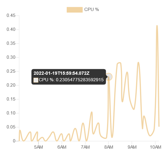
Charting controls are used in AyaNova to visualize data.
Charts adapt to the width of the display, simplifying where there is limited width and providing more details when there is enough width to display them.
Moving a pointer over a chart provides specific details in some cases as in the image above where tracing the timeline with the mouse shows each data point in specific detail.
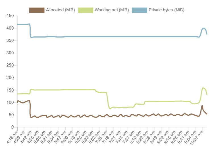
In addition many charts allow hiding or showing plotted items on multiple item charts by clicking on their legend box that describes that item and it's color.
Here is an example of a chart with multiple items plotted on it:
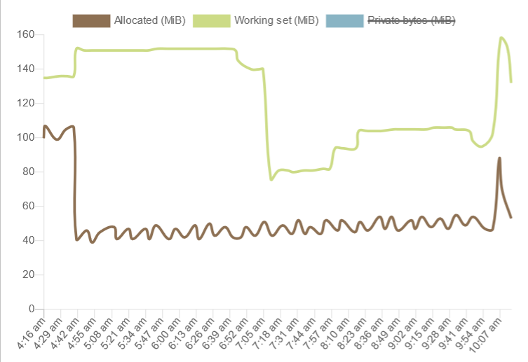
Clicking on the "Private bytes" legend hides that plot line and adjusts the scale:
Currency

The currency control displays and accepts currency input.
The display and input format are controlled by both the device and web browser default settings for decimal numbers and the desired currency code set in the User settings currency code field.
Custom fields
Custom fields are customizable extra fields that can be enabled on each business object form.
These are provided for situations where there are special data items unique to each business that do not "fit" any of the standard AyaNova form fields.
Custom fields are documented on the form customization help page.
Dashboard widgets
Dashboard widgets are documented on the Dashboard help page.
Data table
Data tables are used throughout AyaNova to display lists of business objects and are documented in their own Data table documentation page
Date
The Date control is used to display and choose dates without time. Dates are displayed in the devices local time zone by default but can be overriden.
AyaNova has two versions of the Date control available: the default is a "Material" theme date picker that will display and work the same on any device and the alternative is to use your browsers default system date picker.
Which one is used is controlled in User settings "User browser standard date time input" setting.
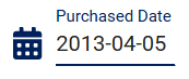
Default "Material" date picker:
Display mode:
Clicking on the display mode date will open the control to Picker mode if the user has edit rights.
Picker mode:
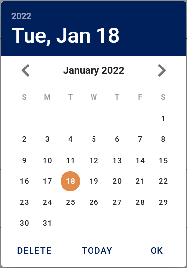
Clicking on the calendar itself in different areas will allow selecting the year, month, moving month to month or selecting a date similarly to all calender input controls.
Deleteoption will remove the date completely.Todaywill set it to the local date for today.OKwill accept the chosen date.
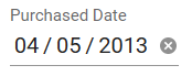
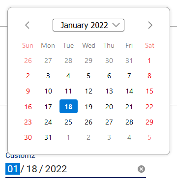
Browser default date picker
Will function and display differently on each type of device and browser, in Windows on FireFox it looks like this:
Display mode:
Picker mode:
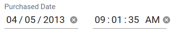
Date and Time
The Date and time control is used to display and choose dates and times as a pair and is the most common date and time related control in AyaNova as most objects require a precise timestamp. Dates and times are displayed in the devices local time zone by default but can be overriden.
AyaNova has two versions of the Date and Time control available: the default is a "Material" theme date and time picker that will display and work the same on any device and the alternative is to use your browsers default system date and time pickers.
Which one is used is controlled in User settings "User browser standard date time input" setting.
Default "Material" date and time picker:

Tip: the quickest way to select the current date and time is to bypass the date component and select Now in the time component which will set both the date and time at once.
See the date section for details on usage of the date component and the time section for details on using the time component.
Browser default date picker
Will display differently on each type of device and browser, in Windows on FireFox it looks like this:
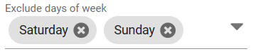
Day of week
The day of week control is used to select one or more days of the week.
When the day of week control is in display mode it shows the selected days and if editable, each day displayed can be removed by clicking on it's delete (x) button beside it:
When the day of week control is opened for selection by clicking on the drop down caret (V) to the right the full list of available days of the week is displayed:
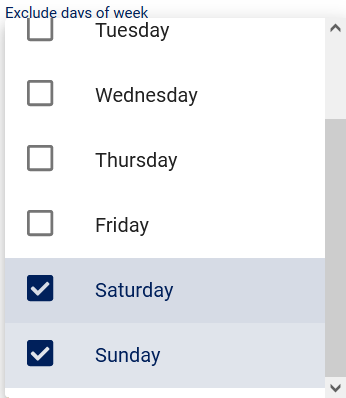
Place or remove a check in the checkbox to the left of a day to select or de-select that day.
Decimal
The decimal control displays and accepts decimal (fractional) number input.
The display and input format are controlled by the device and web browser default settings for decimal numbers.
Dialog
Confirmation dialogs
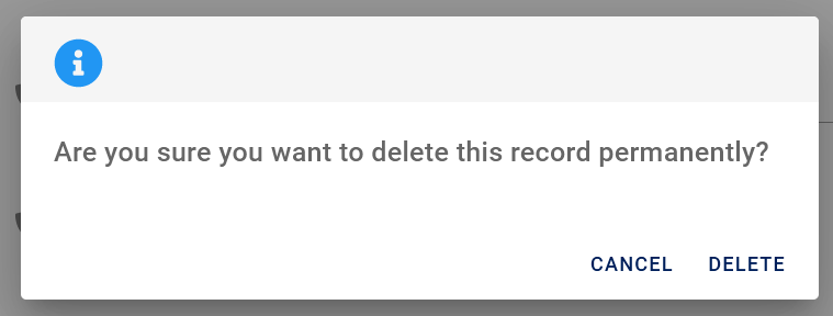
Confirmation dialogs are shown to confirm choices made that may have irrevocable consequences.
Error and warning dialogs
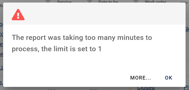
Error and warning dialogs display with a red or orange icon respectively.
More...
Some dialogs show a "More..." button as in the example above, which will open a documentation page explaining the error or warning in more detail.
Duration
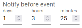
The duration control displays and accepts input of time spans.
Email

The email control displays and accepts email addresses and acts as a 'mailto' link for emailing.
Emailing
To the left of the email display is an @ icon button which, when clicked, will open the device's email application to send an email with the address populated by the contents of the email control.
Menu
AyaNova uses menus at the top of forms for options related to the entire form.
Menus are also used inside forms such as the work order item context menu:
Menus inside forms have options related to a specific sub-section of the form or object only.
Surfaced items
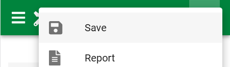
In form menus on wider screened devices with more room, some commonly used menu items are "surfaced" out of the menu and beside the menu's icon, for example on this wide screen device displaying the save button in this edit form:

On a narrow screen device such as a smart phone the save button reverts back to inside the menu to save space:
Notification

Notification controls are used to convey status results of long running operations and temporary error messages.
They appear at the bottom of the browser window briefly and then self close after a period of time determined by how much text is being displayed. Green notifications indicate successful status, Orange indicate a warning and Red indicates an error.
Important errors are also logged to the diagnostic log if you need to see them again.
Percent
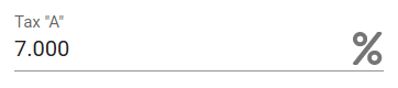
The percent control displays and accepts percentage input in percentage format.
Percentages are entered as the percent required, not a decimal fraction.
In other words you would enter 5.5 to indicate 5.5% not 0.055.
The display and input format are controlled by the device and web browser default settings for decimal numbers.
Phone
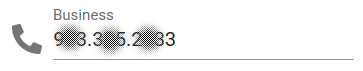
The phone control displays and accepts phone numbers and acts as a 'tel' link for dialing.
Dialing
To the left of the phone number display is a phone icon button which, when clicked, will open the device's dialer application to make a call to the number displayed.
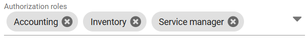
Role
The Authorization Role control is used to select Authorization Roles.
When the role control is in display mode it shows the selected roles and if editable, each role displayed can be removed by clicking on it's delete (x) button beside it:
When the role control is opened for selection by clicking on the drop down caret (V) to the right the full list of available roles is displayed:
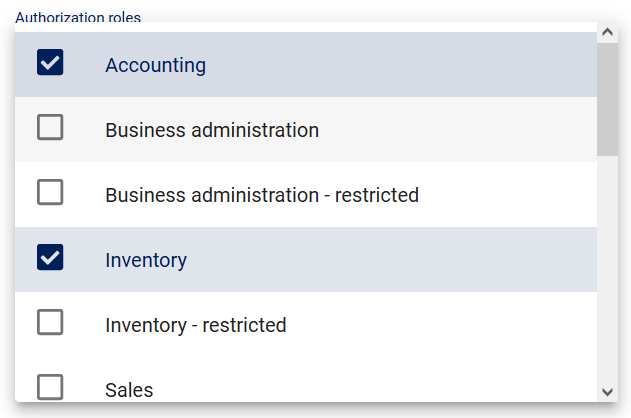
Place or remove a check in the checkbox to the left of a role to select or de-select that role.
Schedule
The schedule control usage is documented in the personal schedule and service schedule form help pages.
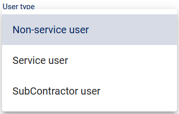
Select
The select control is a simple drop down selection list used for short lists of fixed choices.
Tag
Tags are the primary way to categorize business objects in AyaNova for selection and business process control purposes.
Tag control has it's own Tag documentation page.
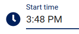
Time
The Time control is used to display and choose a time of day without the date portion. Times are displayed in the device's local time zone by default but can be overriden.
12 vs 24 hour clock
AyaNova will accept input and display times in 12 hour clock AM/PM mode or 24 hour clock mode depending upon the local standard set by the operating system and browser. You can override this to force a particular choice in User settings "12 hour clock" setting.
AyaNova has two versions of the Time control available: the default is a "Material" theme time picker that will display and work the same on any device and the alternative is to use your browsers default time picker.
Which one used is controlled in User settings "User browser standard date time input" setting.
Default "Material" time picker:
Display mode:
Clicking on the display mode time control will open the control to picker mode (if the user has rights to edit the time).
Picker mode:
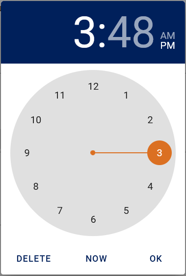
In picker mode a banner showing the selected hour, minutes and optionally am/pm will be displayed at the top. Clicking on this hour or minute display will control which portion of the time is selectable in the central clock face portion of the display. Click on the AM / PM designator to change.
Click in the clock itself to select specific hour or minute.
Tip this control works with a mouse scroll wheel to quickly rotate the hands of the clock.
Deleteoption will remove the time completely.Nowwill set it to the local current time.OKwill close the time picker.
Browser default time picker
Will function and display differently on each type of device and browser, in Windows on FireFox it looks like this:

Upload

The upload control appears in places in AyaNova where you can import or attach a file.
Clicking on the control will open a file browser to select a file to upload. In the specific case of the Attachment control you can also drag and drop a file on to it in addition to clicking in it to open the file selector, see the attachment control help page for details.
URL

The url control displays, accepts and opens URL addresses. Typically this would be a website address but any type of URL can be entered here.
Open URL
To the left of the URL display is an open button which when clicked will send the URL to the devices operating system to be opened. If it's recognized by the device as a web site address then a browser window will open to that address. Other types of URLS will be handled according to the device's URL handler.
Wiki
Each business object form has available a Wiki control that allows for creation of a "wiki" page within each edit form for that business object.
Wiki control has it's own Wiki documentation page.